Portfolio:

Photo Tours Abroad
Photo Tours Abroad offers photography workshops in locations all around the world.
After years of growth and expansion the company found itself in a branding limbo — using a mix of different logos, many of which seemed like ad hoc solutions. Fresh and consistent look was badly needed.
continue »

Brand on Belief
Brand on Belief provides brand development services for entrepreneurs and small businesses. Ted Manasa, who runs BB, wanted me to find a symbol that represents belief, but does not connote religion. Something that would tell a story of a better tomorrow and could represent company’s deep, deliberate and wondrous approach to branding...
continue »

Trzech Kumpli
Trzech Kumpli (meaning “three friends” in Polish) is a new brewery and a new brand of indie beer. We have started out with a few ideas for the brand's symbolism...
continue »

Centurion Design
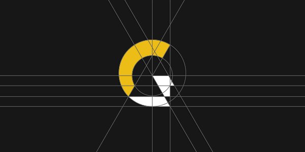
My job was to design a logo for a young team of graphic designers and engineers, with a knack for creating smart and powerful visualizations of architectural and interior design projects.
They wanted a symbol that would be simple, clever and modern, but at the same time connected with the name of their business.
continue »

Asun Asyar
The job was to design a logo for a new internet shop offering high quality cashmere products. Asun Asyar will be selling not only off-the-shelf clothing, but will also allow clients to customize products they would like to buy. This element is an essential part of the brand, as even the name comes from an abbreviation of "AS UNique AS You ARe".
continue »

AVSystem
I was approached by
AVSystem — a Polish software house strongly devoted to Research & Development in cutting-edge telecommunication solutions — with the job of refreshing their branding. They are a group of young, yet already experienced and highly trained technology experts. AVSystem's clients include major players from all around the world and the company is expanding rapidly. But their old logo was still telling a story of a small start-up, so it was about time to replace it with something more up to date.
continue »

ProSecura
My job was to design a logo for an insurance broker, a sister-company for an earlier established business Ciuba&Partnerzy (financial broker office). Client wanted both brands to be visually connected, so it was important to include some traits of the financial company logo...
continue »

Królik
This time my job was to design a logo for a producer of orchard equipment. The company is located in Warka, Poland, and it has been selling its products since 1994, mainly domestically, but also in several other European countries. It has been able to establish a great reputation among their clients by providing high-performance quality products.
Even though it was more than 15 years since its foundation, it still operated pretty much as a no-logo business...
continue »

Jadara
'
Jadara Capital Partners' is a new start-up fund management company based in Dubai. Ahmad Zuaiter, Jadara`s managing partner, has contacted me with the job of creating a logo design for it.
continue »

Rexav
Rexav is a provider of home entertainment and security systems. “REX” comes from the Latin word meaning "king", and “AV” stands for Audio/Visual.
I have been approached by
Krisztian Gabula with the job of designing the company`s new identity.
continue »

ProfisBud
ProfisBud is a producer of timber houses. For their clients they construct “unique projects of innovative houses”. In future, they plan to widen their offer with ready-to-build projects of buildings.
Client described ProfisBud as a company taking pride in the quality of their services, beauty of realized projects and the fact, that the main building material is elegant wood.
continue »

Concretto
Michał Kupczyński, owner:
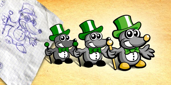
"As the mole is supposed to be the integrating element, it is also the most important part.
It should be cheerful, maybe even a bit childish. Let`s say like manga characters in the Super Deformed style.
Cartoonish looks should work as a way of making clients smile and build a friendly atmosphere of the portal.
We`d like to achieve an impression that our mole is a wealthy, but laid back businessman..."
continue »

Seofriendly Solutions
Tomasz Kołkiewicz, owner:
"We provide services of website positioning and optimization. In general terms — we offer to make your website user-oriented amd friendly for search engines.
I`m searching for help in creating from scratch or rebuilding our limping visual identity. It is probably obvious, but I`m looking for something unique, that would be immediately associated with what we do..."
continue »

WPNinja
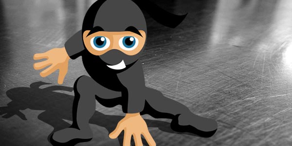
WPNinja is a blog covering everything that is connected with
WordPress (a blog publishing application).
Our first assumption was to create a logo that would take advantage of the catchy name of the service — namely, a mascot of a ninja warrior. The client suggested depicting it in a cartoon-like fashion, which seemed like a good way of communicating basic values of the service — friendliness and openness to readers.
continue »

Lange
Norbert Lange, owner:
"Our business is about transportation of low-mass goods. Our target are clients, who want to send smaller loads, but don`t want their cargo to be mixed up with other cargo. The idea is pretty simple: load the cargo — swiftly reach the destination — unload. No wheeling and dealing. Our characteristics are: speed, security and common sense. What sets us apart from other companies is flexibility and availability..."
continue »


