Case studies:
Brand on Belief logo – case study.

Brand on Belief provides brand development services for entrepreneurs and small businesses. It specializes in positioning small businesses against larger competitors.
BB’s philosophy is based on the idea that brands should be build from business owners' core beliefs (hence Brand On Belief).
Ted Manasa, who runs BB, wanted me to find a symbol that represents belief, but does not connote religion. Something that would tell a story of a better tomorrow and could represent company’s deep, deliberate and wondrous approach to branding.
Ted has also provided me with a few catchy phrases that encapsulate his vision of branding. For example:
"The difference you make in the world is proportionate to how different you are from it."
"Leave the gravity of what everyone else is doing."
“People buy what you stand for.”

First batch of ideas.
I have explored various angles: from escaping gravity, breaking away from the crowd (a flying fish!) to literally placing the word “Brand” on “Belief”. The problem was that the majority of proposals lacked emotional impact, as well as uniqueness in their execution.

Initial favorite.
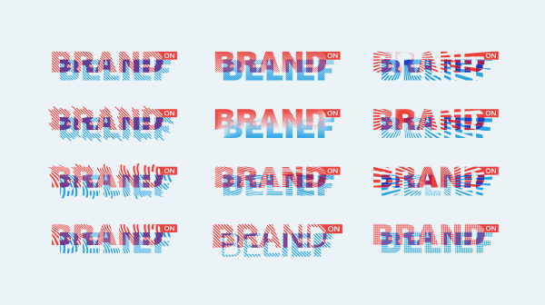
The bright spot was the last option with overlapping elements. It was easily the most distinct and visually appealing design of the bunch. Even though it did not fulfill all of our design assumptions (Ted requested a logo with a separate symbol), we decided that it is the most promising concept and we advanced it into further development.
Brand on (and off) Belief.
top

Testing alternative versions.
I was very hopeful for this design, but the more we worked on it, the less it seemed like the solution that Ted was searching for. In particular, introducing a separate icon felt like a lost cause, and it turned out that I had seriosuly underestimated how important it was to Ted.
After a while, we decided that it would be best to just start from scratch with a reviewed set of guidelines.
Ted has come up with with a new idea that could capture his brand's core message. It was the story of Galileo, who proved that it is Earth which orbits the Sun, and not the other way around. Galileo remained faithful to his beliefs, even despite heavy opposition and threats from the Church, and later on became known as the father of modern science.
This story not only reflected Ted's ideas about branding, but also seemed much better suited for our needs in regard of designing a logo, as it provided some visual footholds that we could use. Moreover, Ted proposed his own concept for a symbol connected to the Galileo’s story: Sun breaking out from the center of the Earth.

Earth & Sun.
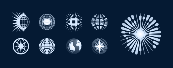
This round of sketching turned out to be much more tiring than the first one — I really felt like I had enough globes for a year.
Even though most of the concepts were quite underwhelming, there was one that clearly stood out as the one idea worth pursuing.
A basic Earth-shape. Nothing special here yet, but it was important to establish some point of reference for further exploration.
First attempt of redrawing the planet creatively and adding an explosion. Clearly failed, as it’s way too crowded and the interaction between elements seems forced and superficial.
Radial beams work much better for this job. While the explosion becomes an integral part of the design, it is also
a very energetic and unique approach to the globe cliché.
Making land areas better visible by slight changes to their shapes, but, most of all, by thickening continent-rays as they get further away from the center.
Everything redrawn from scratch. Further improvements to the shapes of continents (especially Europe and South America) and overall recognizability.
Going nuclear. Ted really wanted the explosion impression to stand out, as it represents his energetic personality and maverick approach to branding.
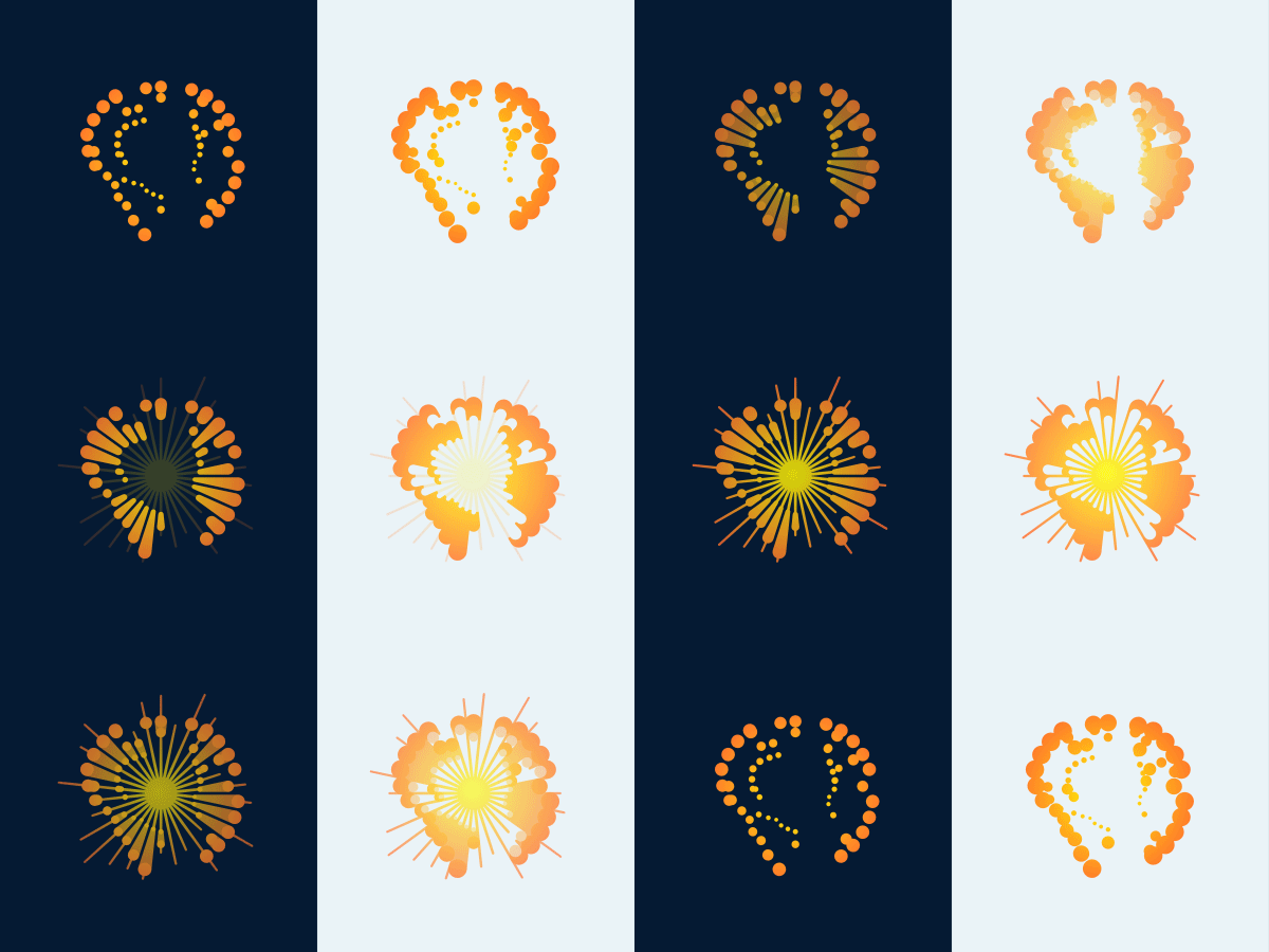
We were both very happy with our explosive symbol on a dark background. But it was a separate problem to prepare a version for bright backdrops, which was clearly needed, as the original rendition did not work great on white. We had to try out several different approaches, but in the end we were able to find the perfect solution.

Loud and clear.
Stages of development of the symbol version suitable for bright backgrounds. Changes to its construction — compared with the initial, dark-background design — were necessary to ensure proper visibility and functionality in all applications.

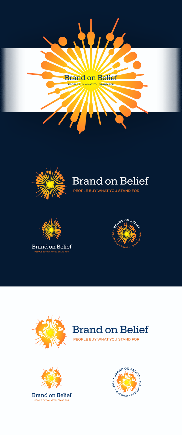
Comparision of both symbol versions.
You can take a closer look at how each of the two variants of the mark is structured. Continents in the bright background version had to be additionally emphasized to improve their visibility, especially so if we wanted to keep the explosion-like color scheme (and we did).

top
Case Studies »
(
Photo Tours Abroad,
Brand on Belief,
Trzech Kumpli,
Centurion Design,
Asun Asyar,
AVSystem,
ProSecura,
Królik,
Jadara,
Rexav,
ProfisBud,
Concretto,
Seofriendly Solutions,
WPNinja,
Lange)


