Case studies:
Trzech Kumpli logo – case study.

Trzech Kumpli (meaning “three friends” in Polish) is a new brewery and a new brand of indie beer. We have started out with a few ideas for the brand's symbolism:
- Three buddies having a beer together.
- Depicting Svetovid — a four-headed, Slavic god of war, fertility and abundance.
- Client was a big fan of Art Deco style, so we needed to try it out as well.

Exploration.
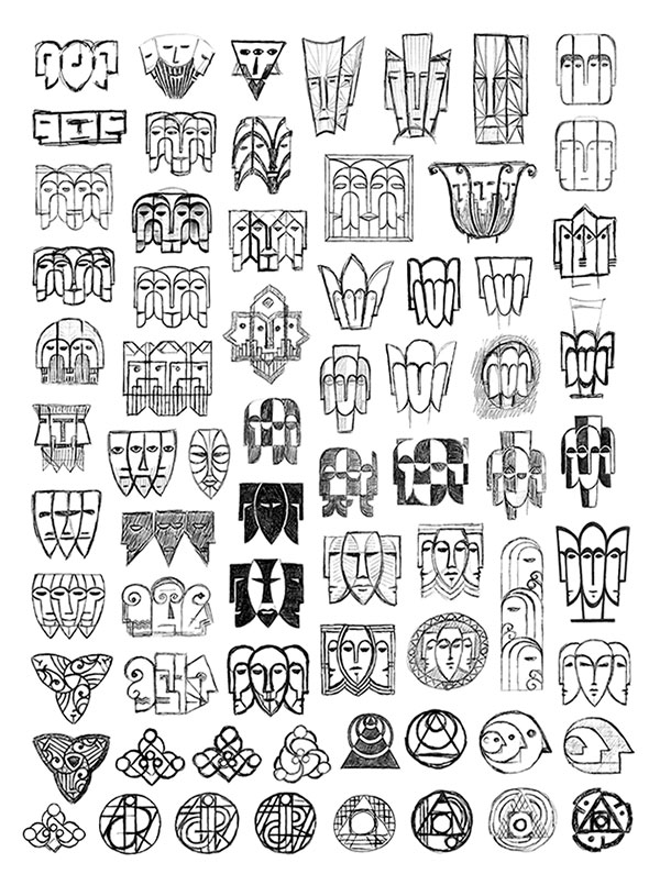
Triple-headed characters dominated this phase, although a few other concepts also managed to squeeze in.

A.
First concept is a simple geometric representation of three friends sitting at the table, having a beer.

B.
Second idea refers to Svetovid, the four-headed deity.

C.
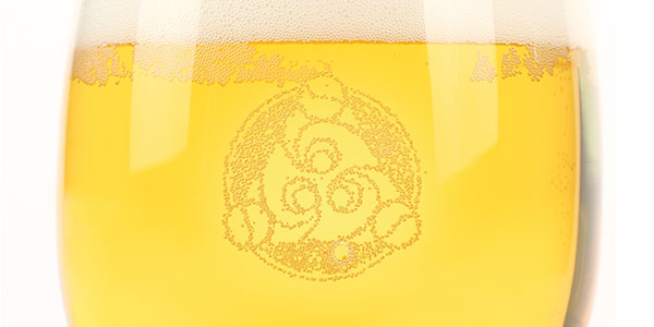
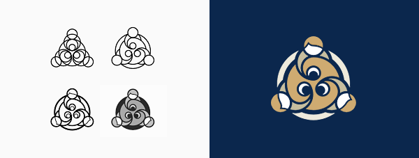
The last one is a more radical and expreimental solution, inspired by alchemical symbolism (the first shape stands for the creation of the Philosopher's Stone). At this point different beer styles were supposed to have names of chemical elements, so I thought it might be an interesting approach.
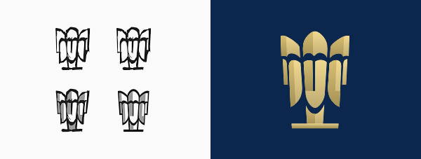
The first proposal has been selected for further exploration, due to its simplicity and clear representation of the company name.

Symbol.
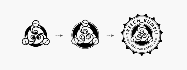
My client rightly pointed out that the initial draft was a little too heavy, while beers were too dark for the first (and most imporant) brew of the company's light beverage. While working on these elements I have also come up with the idea of encapsulating the whole logo with a cap-like shape, that would clearly suggest some kind of beverage.

Lettering.
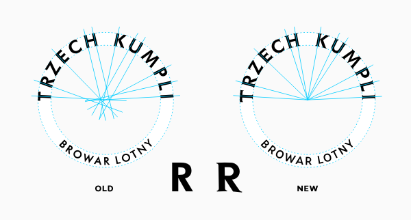
At this point lettering was far from satisfactory — glyphs were just placed on a curve, not following it, and they were not "open" enough for optimal readability at small sizes. Image on the left shows how it all got radically improved.

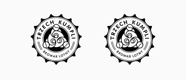
Logo before/after...
...changes to the lettering.

top
Case Studies »
(
Photo Tours Abroad,
Brand on Belief,
Trzech Kumpli,
Centurion Design,
Asun Asyar,
AVSystem,
ProSecura,
Królik,
Jadara,
Rexav,
ProfisBud,
Concretto,
Seofriendly Solutions,
WPNinja,
Lange)


