Case studies:
Jadara logo – case study.
 “Jadara Capital Partners”
 is a new start-up fund management company based in Dubai. Ahmad Zuaiter, Jadara`s managing partner, has contacted me with the job of creating a logo design for it.
Jadara Capital Partners (JCP) will focus on 'Frontier' emerging markets (or exotic emerging markets in the Middle East, Africa, Central Asia and Southern Asia). These countries/markets tend to be the most difficult, volatile, risky and inefficient vs. other emerging markets and JCP is essentially a 'pioneer' or 'leader' in discovering these markets and exploiting them for it's investors. JCP gains its ability to do so via foresight, vision, first-mover-advantage and (most importantly) competence/merit/'intellectual fitness'. JCP will be based out of Dubai-UAE.
We are looking for a Logo that is clean, modern, minimalistic and abstract. We would also like it to incorporate some regional/cultural reference (maybe Arabic or African).
— Ahmad Zuaiter, Jadara Managing Partner
After being provided with the above information, I talked to Ahmad to clarify our design principles even further. We decided that even though Jadara positions itself as a pioneer in a new, dynamic land, it would be a good idea to stress experience standing behind it and its ability to prosper under difficult circumstances. Ahmad proposed an olive tree as a possible symbol that would be able to convey these ideas, as well as having appropriate regional connotations. In the end, this idea turned out to be very crucial...
Jadara logo concept A
Concept A.
This proposal has evolved out of combined shapes of a percentage and an infinity symbol (unbounded profits!;-). Another inspiration: ornaments that are used on valuable papers and certificates of authenticity. The whole logo gives an impression of elegance, seriousness and dealing with money. Although there might have been some potential for improvement, the more I looked at it, the more I felt that there is something wrong with this idea. First of all, percentage and infinity are far from being clearly visible. Another issue was that I couldn`t stop seeing “R” there (or even two of them).
Concept B.
It is a concept based on
Nyansap, a West-African symbol of wisdom. I have tweaked it and added some elements, so that it would be more distinct and would resemble a bearded wise-man. It is very abstract and simple, it also has the regional reference in a slick, modern form. Yet, its underlying concept — even though I liked it for a while — seems a bit forced and overthought.
Concept C.
I started this design with an idea of an olive tree, that Ahmad had planted in my mind, and with hope of adding some Arabic flavor to it. I think it has turned out pretty nice, although during the process the everlasting olive tree seems to have morphed into some anonymous plant. On a more positive note, even though it is constructed with just a few lines, it is clearly recognizable as a tree and is quite pleasing to the eye. Moreover, Arabic-inspired, custom made lettering it is accompanied by follows its form very closely, so both these elements form a harmonious and cohesive unit.
Concept D.
Olive tree enclosed in an Arabic-esque shape. It is very esthetic and pleasing, but I was not sure at all if that would be the best choice for this company. This time the olive tree was much more recognizable and lifelike, but almost all the way to the point, that you would expect a bottle of olive oil behind it.
Concept E.
This time, I tried to go for an African feel. The mask is directed right, looking into the future, self-confident. It is a head, so it may be viewed as bringing up ideas of thoughtfulness, planning and leadership. Like most of other propositions in this bunch it is still just a sketch. One way or the other, the client has decided that Arabic references are preferred, so this design was out of luck.
Mutations and survival of the fittest.
top
Ahmad pointed out C and D as clear favorites, finally selecting D as the idea we should go with.
At this point, none of us was absolutely happy with the design, so we knew there is much development yet to be done. First of all, Ahmad did not like the shape containing the tree — he told me that it goes way too far with the regional idea, confining the logo to the Arab world only. He also wanted to try out pairing the symbol with a different lettering, as the current one has been designed specifically for option C, and here it only worked on a temporary basis.
So, after a while, I came up with alternative proposition of lettering and the enclosing shape:

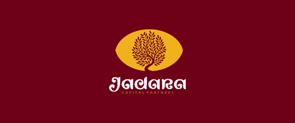
Concept D2.
It didn`t took us too long to realize, that this one was a dud. The new logotype might be interesting on its own, but it doesn`t match well with the needs of a financial company — it is just too loose and frivolous.
The symbol has been designed to resemble an eye, with the tree forming an iris. I thought that it might be an interesting addition of a "vision" feature to our logo. But in the end, all I can say is that it only cheapened its appearance, making it look like someone (ok, it was me) has tried to force too much symbolism into it.
Even though this revision was a failure, it was an educating one. We have realized that the enclosure only complicated the symbol and made it heavy, so we got rid of it altogether. Now we also knew what we would like to do with the lettering — it should be respectable, solid and possess some Arabic feel, but not trying to imitate Islamic calligraphy. Moreover, we decided that coloring should be much more subdued and subtle, close to being completely desaturated. This approach turned out to be the right step towards a trust-inducing brand.
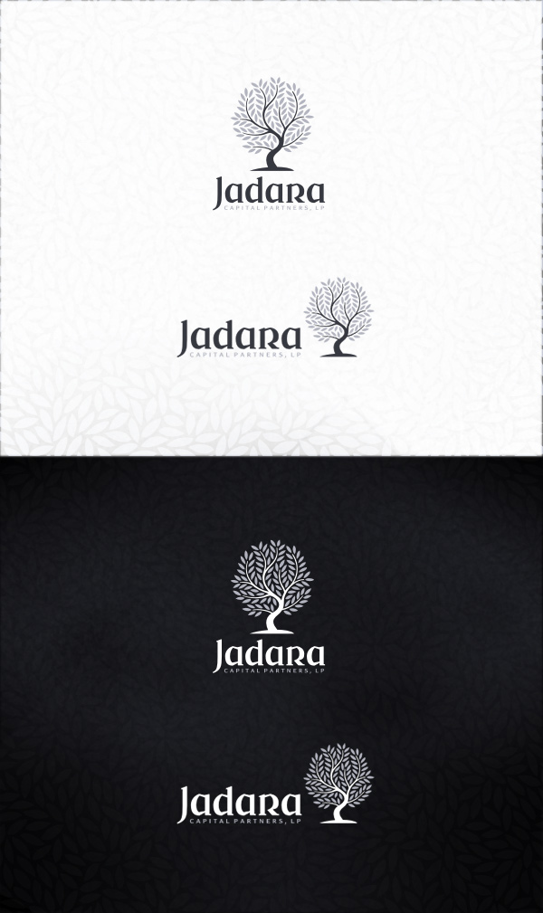
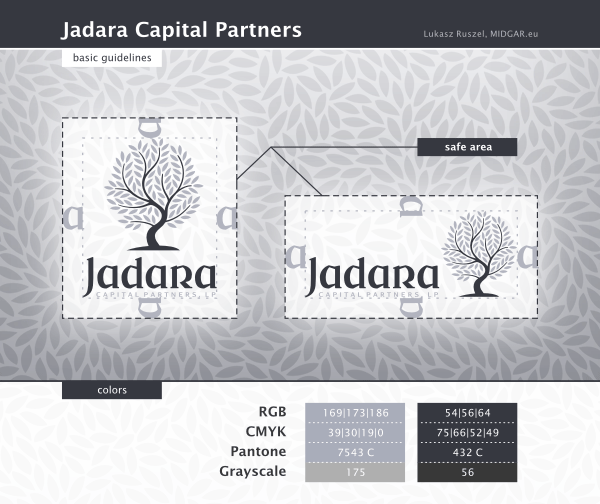
With all of these conclusions in mind, I was able to come up with a design that was almost identical with the final one. We just had to test out a few slightly varying coloring options and it was ready to conquer the world.
The Summit of Creation.
top


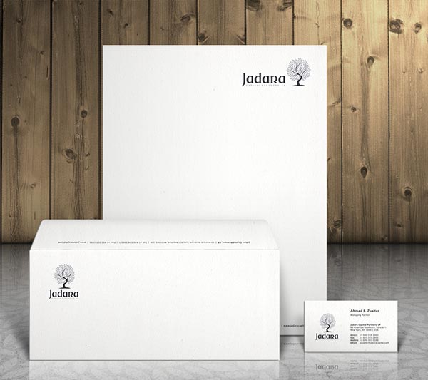
Stationary.
I have also designed a stationary set for Jadara. Ahmad wanted it to be really simple and restrained.
top
Case Studies »
(
Photo Tours Abroad,
Brand on Belief,
Trzech Kumpli,
Centurion Design,
Asun Asyar,
AVSystem,
ProSecura,
Królik,
Jadara,
Rexav
ProfisBud,
Concretto,
Seofriendly Solutions,
WPNinja,
Lange)


