It depends on the specifics of a given project.
Get a quote...
What makes a good logo?
top
Good logo is an original idea communicating company`s business philosophy through a simple form.
- Original idea secures uniqueness of corporate identity.
- Communicating business philosophy helps clients associate symbol with the message we want to send to the world about the product.
- Simple form makes it easier to memorize the symbol and use it in various applications.
I always try to keep above characteristics in mind while working on my designs. I also love this quote from Pablo Picasso:
“To know what to leave out is art.”
I think that I have managed to gather an interesting set of projects in my portfolio, and that it speaks better of my experience and quality of work than some marketing mambo-jambo. If you need a visual identity, logo or some other graphic design — I am happy to help:-)
What can I do for you?
top
I specialize in designing visual identities, especially brandmarks. I design business cards, stationery, web layouts, presentations, marketing gadgets, leaflets, posters, icons and more. However, I do not code websites (at least not myself).
You need something else?
Ask me...
How long does the project take to finish?
top
Short answer — as long as it takes.
A bit longer version based on my experience — from a few weeks, up to a few months.
To elaborate on the subject — in case of a logo design project the only strict deadline is two weeks time I give myself to provide client with initial proposals. After this stage comes the phase of revisions and modifications, and as I don`t restricts the number of those, it is really hard to tell how long will it last. Especially, as it is also the time of intense communication between me and the client, so the quickness of responses to my successive mails becomes crucial to the swiftness of the process flow.
Time is of great importance to you and you need the job completed as soon as possible? Prepare a proper briefing and be ready to make decisions quickly regarding presented proposals.
How does the cooperation look like?
top
My standard step-by-step scheme of work on a logo design. Below I try to explain consecutive stages of the design process and clear some possible doubts about it.
- Before starting up a project I always request my clients to take some time and think about their needs and expectations. The goal is to gather and provide the designer with as much information as possible (read more about briefing). The more input I get, the better likelihood of finishing with a design that satisfies both client and me. We all like happy-endings, don`t we?;-)
- I begin working on a task after receiving a pre-payment of 50% of project cost on my bank account.
- In a maximum 14 days time span I provide the client with at least 3 conceptually different logo proposals.
- The client decides which version of the logo suits his needs best. We focus on the selected design and revision it until we get a fully satisfying effect. The number of revisions, corrections and changes is limited only by the sense of decency;-)
- When the final version of the symbol is constructed and everything is spot-on, the second part of the payment should be transferred to my account. In the meantime, I work on technical details and prepare final files of the design.
- After receiving the money, I hand over resulting files to the client.
Can we start right away?
top
Most probably, but please
contact me to make sure.
What information do I need? What is a briefing?
top
Briefing is a more or less formalized set of hints and guidelines, that are supposed to introduce designer to the job and its goals. Logo is (or at least it should be) part of a larger picture, which is visual (and corporate) identity of a company or product. That is why it is extremely important for it to represent some kind of philosophy, ideas behind it, the way we would like our enterprise to be seen.
To accomplish this goal the designer has to be provided with some information. Otherwise the resulting effect might turn out to be just a "beautiful picture", which has next to none connection with the identified entity. And that certainly is not very helpful in building a successful and coherent corporate identity.
One thing is pretty certain — no one knows more about your company and its needs than yourself. That is why before starting up a project I advise my clients to try to answer some questions for themselves.
Briefing — helpful questions:
- What should the logo be telling to your clients?
- What message should it communicate?
- What should it be associated with?
- What kind of emotions should the symbol invoke?
- What makes your company stand out in a crowded market?
- What separates it from competition, what makes your offer unique?
- What kind of values do you represent?
- Who is the target audience of the message?
Briefing is a really important part of the design process and that`s why I`ve prepared a short list of elements it can be built around. I hope it will be useful and will help us start the project based on mutual understanding.
Briefing — exemplary elements:
- Text elements that should be included in the logo design, for example: company name and tagline.
- Preferences regarding the structure of the logo, for example an alternative between a logotype/wordmark (stylized company name) and a combination of a logotype and a graphic symbol.
- Impressions and emotions that are most desirable to be connected with the logo. For example, it may be shown as a set of words like: responsibility, stability, tradition, world-wide-business... Please try to avoid contradictions and over-general terms — in the end, almost every bank (and most part of other enterprises) wants a business-professional identity, and best attributes are those that can separate your company from the pack!
- The target group. Who are they? What do they like and expect? What are they looking for?
- Why should people choose your offer? What is special and unique about it? What separates it from the competition?
- If the job is to revitalize an old logo or to design a new one from scratch, please provide me with the old one. Try to explain why have you decided to change it and what do you like and dislike about it.
- Collecting (and presenting them to me) some existing logos that could be helpful in laying down a path to our own logo. The same applies to marks that present clear "don`t do that" elements. Just keep in mind that in both cases it is not just about showing some good/bad designs (believe me — I`ve seen thousands of both:-), but pointing out some specifics — for example, "I like the futuristic typography of this logo, I think it would go great with the advanced technology we offer" or "this logo seems way too heavy and dense — we would like to be seen as modern, mobile and always ready for changes".
- Providing me with some info on your competition might turn out to be helpful. This time I especially mean their visual identities/logos. We don`t want to waste any energy on duplicating some of solutions that are already there — the whole idea of creating identity is still "separation from the pack", not to mention possible legal problems... Of course I always do a decent research on my own in this department, but who better to ask than the client himself?:-)
- (Un)desirable colors, symbolism to be used, etc.
Of course answering all of above points is not required — it is not about filling out some kind of a school paper. The important thing is to let me know what do you need and expect. I have to feel what your company is about, what direction you want to go. My clients are not always able to clearly state their requirement and I`m always happy to help with this. Often, the first logo concepts — or just the flow of communication between me and the client — can really help us to get on the right track with the design process. But we have to have some starting point. Even a bit fuzzy and abstract "feel" of the whole idea is much better than nothing. Starting up with a random walk can be really frustrating and might turn out to be a painful waste of time — both client`s and mine. Therefore,
please try to tell me what you need, so I can make it happen!
What files and versions of the logo does the client get?
top
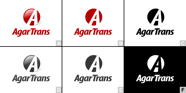
I provide each logo in various versions appropriate for different applications:
- Full, basic logo version.
- Monochromatic logo (grayscale).
- Achromatic logo (black on white).
- Negative achromatic logo (white on black).
- In some cases, due to a specific construction of the logo, even more versions are created (horizontal and vertical, with gradient fillings, simplified versions, etc.).

Exemplary logo versions:
A. Logo with gradient fillings.
B. Basic logo version.
C. Achromatic version.
D. Gradient fillings, grayscale.
E. Monochromatic.
F. Negative achromatic logo.
All of those variants are provided as:
- Vector files — CorelDraw (.cdr) and AdobeIllustrator (.ai) formats.
- High resolution raster files — gif and jpg formats.
- Providing logo in almost any other format imaginable is possible upon request.
What is a Book of Logo?
top
Logo is the basic and most important element of brand identity. Therefore, it is very important to use it accordingly to the design principles. Book of Logo is intended to be a simple set of guidelines that, hopefully, will be helpful in meeting those requirements.
Book of Logo usually consists of:
- Description of a logo and its elements.
- Versions and variants of a logo.
- Description of logo`s colors in standard color models (RGB, CMYK, Pantone).
- Logo`s safe area, which is a minimal zone surrounding the logo, that should remain free of any other visual distractions (texts, graphics, edges of the screen/sheet). It secures the logo from any inappropriate intrusions and ensures that the symbol is adequately presented.
- Minimal sizes of a logo reproduced in various applications. Defining minimal sizes (and sticking to them!:) secures logo`s readability.
- Incorrect applications of a logo and suggestions on how to avoid such situations.
- Presentation of all stationery and any other additional elements of visual identity.
Getting a Book of Logo is not a must, but it is surely recommended to everybody. It standardizes logo`s usage and stabilizes company`s visual identity. It helps to avoid many possible errors and contributes to building a good name for your enterprise.


