Case studies:
 WPNinja
 is a blog covering everything that is connected with
WordPress (a blog publishing application) — from general advices, reviews of plug-ins, technical specifications, curiosities to latest news and updates. The service targets both experienced users and people who are completely new to the field.
The blog is run by three editors who posses extensive knowledge on WordPress and are truly passionate about it. Their goal is not only to publish interesting and useful articles, but also to interact with their readers and answer all questions and suggestions that come up in the comments-section of the blog. Thanks to that WPNinja can pride itself on gathering a lively community of WordPress enthusiasts..
Mr
Szymon Skulimowski — one of the WPNinja creators — has contacted me with the job of designing a logo for the blog.
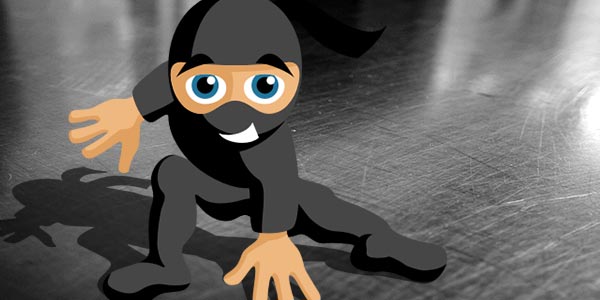
Our first assumption was to create a logo that would take advantage of the catchy name of the service — namely, a mascot of a ninja warrior. The client suggested depicting it in a cartoon-like fashion, which seemed like a good way to communicate basic values of the service — friendliness and openness to readers. We`ve assumed that impressions of professionalism and competence were, in a way, secured automatically, as we planned to use a figure of a Japanese warrior (routinely associated with mastery of their skills). At the same time cartoonish looks should be able to soften any “deadly” connotations.
We also wanted to include some elements that would refer to the blogs subject matter. The simplest and probably the best way to do this was to use the color scheme and lettering similar to the one applied in the WordPress logo.

WordPress logo.
Another part of the job was including the blog`s tagline — “Poznaj Kung-Fu WordPressa” (“Learn the WordPress Kung-Fu”).
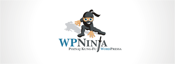
The first effect of my work was a pretty developed proposal that seemed to cover all project principles quite well:

First design for WPNinja.
It`s easy to spot that this graphic is not far away from the final shape of the logo. Our ninja is friendly, cheerful, seems a bit like a joyful rascal, and his dynamic pose indicates that he`s ready for action at any moment. All of this seems very adequate for a service that is not supposed to be a stiff journalistic column, but rather a place were one can meet a group of passionate people who are glad to discuss their ideas, share opinions, are always glad to help and have fun.
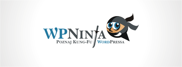
We were very happy with this project, nevertheless we have decided to search for some alternative approaches, that would let us gain some more perspective. Szymon liked the shape of the logotype and replacing the letter “J” with a sword, so we decided not to change this element and work just on new graphic marks. These are the alternative proposals I came up with:

Alternative proposals.

The first graphic was designed to try out how the logo would look like in a less playful version, with a more iconic mark. Just as we had expected it seemed to reserved and all-so-serious. It didn`t really convey the spirit of the service.
The second design is more similar to the original one and much closer to its assumptions. However, Szymon without any hesitation decided that we should come back to the very first project.
After checking out possible alternatives, we have come back to the original project with a clear conscience. We have tried out many tiny changes, but finally we have dropped out of most of them and ended up with just a slightly modified version of the original design (i.a. shape of the sword, the shadow on the background and on the figure itself).

Final version of the WPNinja logo.

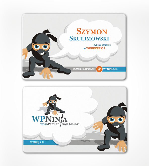
Business card.
top
Case Studies »
(
Photo Tours Abroad,
Brand on Belief,
Trzech Kumpli,
Centurion Design,
Asun Asyar,
AVSystem,
ProSecura,
Królik,
Jadara,
Rexav,
ProfisBud,
Concretto,
Seofriendly Solutions,
WPNinja,
Lange)


