Case studies:
 Concretto.pl
 is a parent-portal, which is planned to associate other commercial websites (both connected with the main portal and independent) under new internet currency. Money gathered by users in a form of a virtual currency can be easily exchanged into various goods, services and cash.
I was approached with the task of designing a logo for the new enterprise by
Michał Kupczyński, one of Concretto`s creators, with whom I had successfully worked with in the past on some other project...
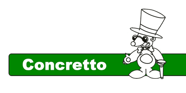
It turned out that test-version of the portal already had a temporary logo. Its main element was a mole-mascot:

Concretto`s temporary logo..
Michał and his associates wanted to keep the idea of mole-mascot and maybe even use it as a way of signaling connections between consecutive portals. They have also provided me with pretty compelling briefing:
The idea is, that the mole should connect relative and cooperating portals.
As the mole is supposed to be the integrating element (..), it is also the most important part. It should be cheerful, maybe even a bit childish. Let`s say like manga characters in the Super Deformed style. Cartoonish looks should work as a way of making clients smile (and therefore induce a good mood) and build a friendly atmosphere of the portal (logo and website`s design tell a lot about website itself).
We`d like to achieve an impression that our mole is a wealthy, but laid back businessman.
— Michał Kupczyński, owner
Moreover, I have been informed that green had been selected as a primary color for the whole enterprise, hence using it in a logo would be desirable.
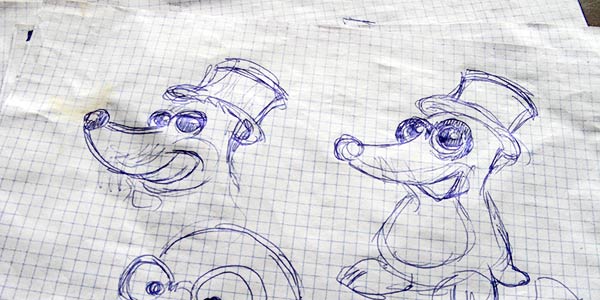
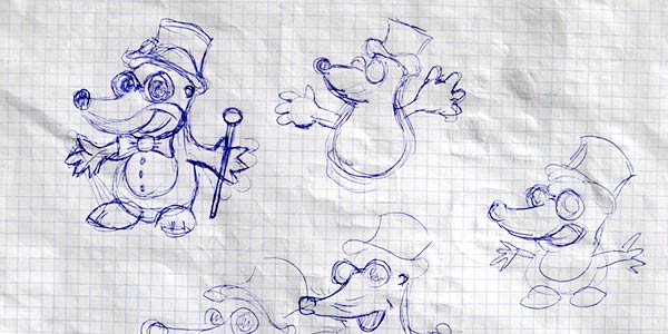
Expanded description of company`s inner workings and detailed information about logo`s expected role let me quickly get on the right track. The first few sketches were enough to obtain mole`s rough silhouette, which stayed more or less the same through the whole process:

Mole — first sketches.

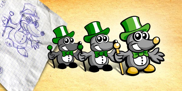
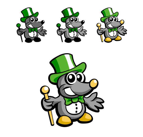
After being transferred from paper to vector graphic our little hero gradually gained good looks and life:

Mole — evolution.
None of us had any doubts whether this is the right way to go, and that Concretto looks pretty good. The next stage was creating an appropriate logotype to go with the mascot. After some tests we have come up with the final result — full logo of concretto.pl:

Concretto.pl logo — final result.
The logo is accompanied by a Basic Logo Card, which describes its safe area and colors used. You can look up the BLC
here.
Later on, we have also created another logo (for the portal
do-zera.pl) based on the concretto.pl symbol:

Do-zera.pl logo.
Working on the Concretto.pl project was a pure pleasure, and I hope that this was not the last time I had the opportunity to cooperate with
Michał Kupczyński:-)
top
Case Studies »
(
Photo Tours Abroad,
Brand on Belief,
Trzech Kumpli,
Centurion Design,
Asun Asyar,
AVSystem,
ProSecura,
Królik,
Jadara,
Rexav,
ProfisBud,
Concretto,
Seofriendly Solutions,
WPNinja,
Lange)


