Case studies:
Centurion Design logo – case study.

My job was to design a logo for a young team of graphic designers and engineers, with a knack for creating smart and powerful visualizations of architectural and interior design projects.
They wanted a symbol that would be simple, clever and modern, but at the same time connected with the name of their business.
Having exchanged several emails with my client I decided to start my research process by looking up centurion-based symbols that had been created previously.

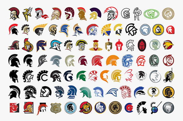
It's a whole army!
It turned out that the archetypical Roman warrior is quite a popular theme in branding. Most of these designs depict centurion's profile, as it helps to highlight the very characteristic plume on top of the helmet.

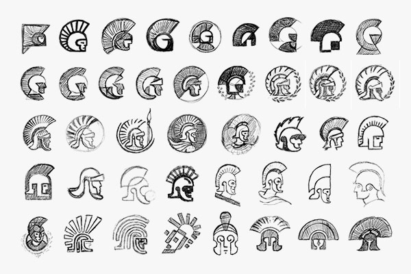
First draft.
Some of my early attempts of capturing essential features of a centurion soldier.

Promoting best recruits.
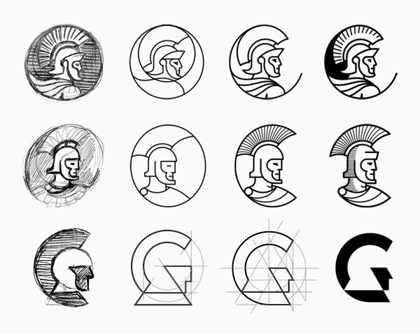
The first two concepts, while quite nice (especially the second one), were too complicated and not unique enough. The last one seemed very much on target and easily the best match for the company. From this point on, I have concentrated my efforts on refining it.

Symbol.
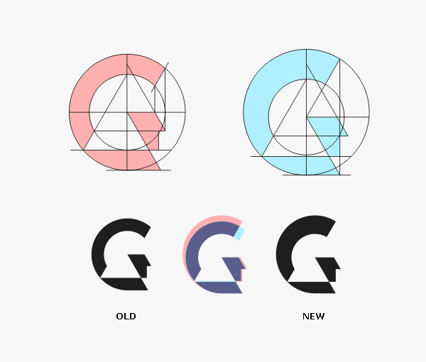
I made the plume more prominent and the whole shape more dynamic and visually interesting. I also wanted to make the head easier to identify as belonging to a centurion.

Lettering.
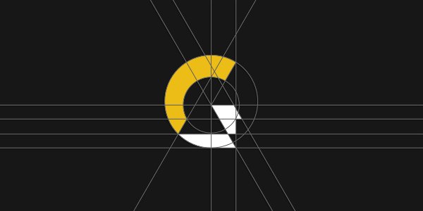
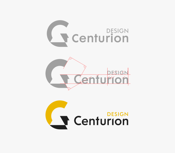
A series of minor modifications aimed at improving cohesiveness of both elements of the logo.

Combat ready.
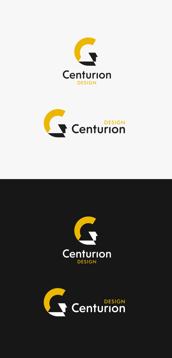
I was able to create a very minimalistic, yet easily recognizable depiction of a centurion's head. A smart design that my client was thrilled with.
top
Case Studies »
(
Photo Tours Abroad,
Brand on Belief,
Trzech Kumpli,
Centurion Design,
Asun Asyar,
AVSystem,
ProSecura,
Królik,
Jadara,
Rexav,
ProfisBud,
Concretto,
Seofriendly Solutions,
WPNinja,
Lange)


